Web Design

What is website appeal?

The key factors which define overall website appeal

Have you ever wondered why you find one website more appealing than another?  A set of interviews by Moshagen & Thielsch in 2010 entitled ‘Visual Aesthetics of Website Inventory (VisAWI)’ showed there were four key facets which played an important role in the make up of websites: Simplicity E.g. Everything goes together on this site. […]

The key factors which define overall website appeal Read More »

Welcome to Neon Web Design Poole, the same but different

Welcome to Neon Web Design Poole, the same but different

As of today, Charlotte Coleman: Web Design has become Neon Web Design, and is now based at Poole, Dorset. The values of the business will stay the same, and Charlotte will now be joined by copywriter Melanie, graphic designer Sarah and web developer Matt. Check out the about page for more information. We look forward

Welcome to Neon Web Design Poole, the same but different Read More »

lancaster-xmas1

Thoughtful Christmas card from Lancaster University

My old university, Lancaster, doesn’t normally send out Christmas cards to its Alumni, but this year we’ve received an email which links to a really well thought out and beautifully presented set of videos. The videos are interviews with academics discussing a range of festive topics.  In short, its the best virtual Christmas card I’ve

Thoughtful Christmas card from Lancaster University Read More »

Learn web design, web and iOS development online with Treehouse

Learn web design, web and iOS development online with Treehouse

Carsonified’s new online teaching environment Treehouse allows users to learn about web and mobile design and development. Here is the slightly eccentric launch video: Although there are similar services available (Codeacademy and Lynda), Treehouse uses gamification to make the process interactive.  For instance, upon watching a series of videos, users complete quizzes in order to

Learn web design, web and iOS development online with Treehouse Read More »

Responsive designs for different-sized viewports and device resolutions

Responsive designs for different viewports and devices

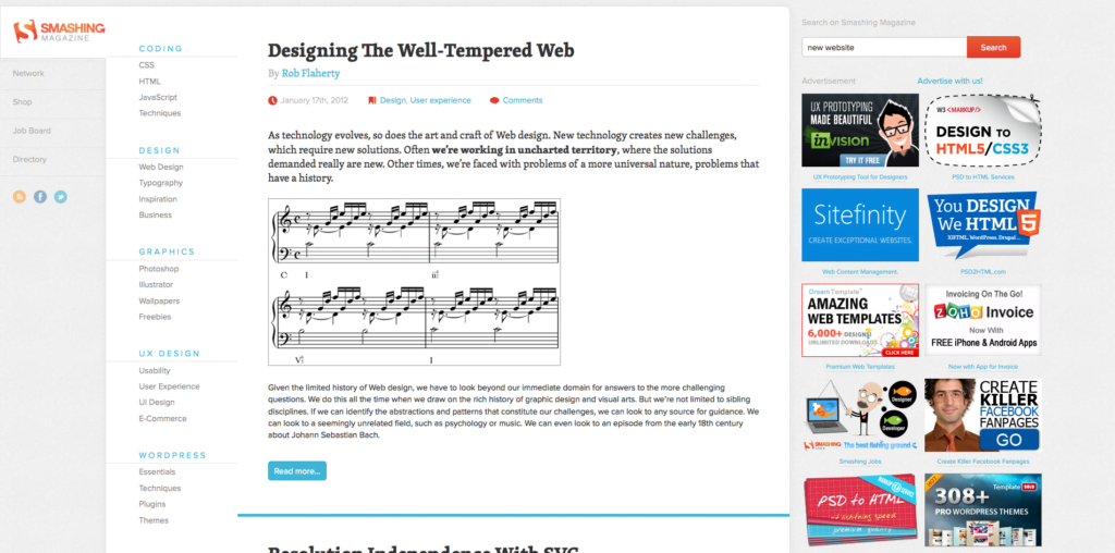
Online design blog Smashing Magazine have recently redesigned their website.  With the increased usage of mobile devices over recent years, now is the time to consider a responsive design (or liquid layout) to handle all the different device resolutions. Instead of a fixed width layout which sets the website to a width that matches the

Responsive designs for different viewports and devices Read More »

Scroll to Top