Online design blog Smashing Magazine have recently redesigned their website. With the increased usage of mobile devices over recent years, now is the time to consider a responsive design (or liquid layout) to handle all the different device resolutions.
Instead of a fixed width layout which sets the website to a width that matches the smallest of the most popular computer monitor resolutions, this method uses the full width of the view port.
Therefore, theoretically it should be preferred as the user can see as much of a website as possible without scrolling. In practice, the design of such a website is crucial as get it wrong and users with large resolutions end up with big spaces in the centre of the website.
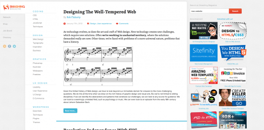
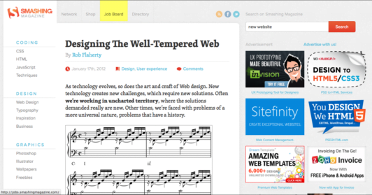
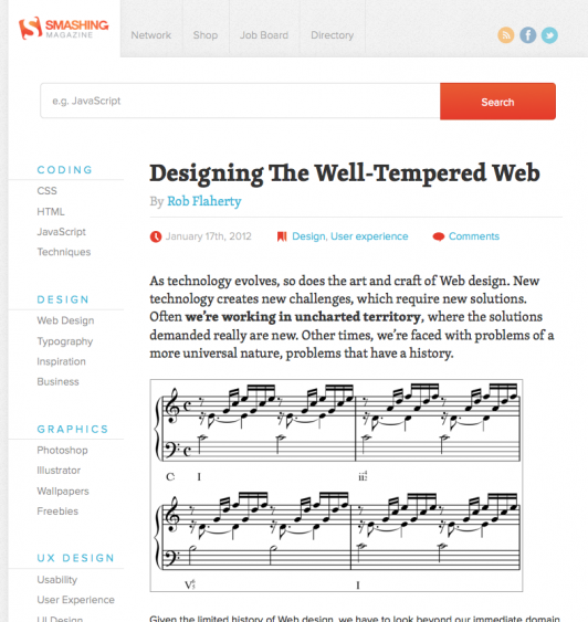
However the Smashing Mag redesign, I’m happy to say, is an excellent example of getting it right. It is extremely well executed, with 6 different layouts depending on the device used.
For a large resolution (computers from about 1680px wide), you see the whole site at it’s widest. A secondary navigation is set to vertical and the main body of the article is wide.
At an average computer monitor resolution (1440px to 1280px wide) the secondary navigation becomes horizontal and the main body decreases a little.
At the smallest, most widely used computer monitor resolution (1024px wide), you see a graceful degradation of the design. The navigation that was on the left is condensed and now appears horizontal also. This shows a graceful degradation of the website.
From widths below 1024px we are in the realm of mobile devices. Here is the layout for an Apple iPad:
And less than 800px the final two designs for smart phones.
In terms of usability, these devices have much smaller screens and are often touch screen. Therefore, simplicity is a key requirement.
The benefit of a responsive design is that you can deliver different layouts containing similar content for every device; and your content is presented at its best to all audiences.


