

Colour is one of the first things people notice when they land on your website – often before they’ve read a single word. Whether you realise it or not, your colour choices are already communicating messages about your brand.
For small businesses, understanding colour psychology can make the difference between a website that feels right and one that quietly puts people off.
Why Colour Matters More Than You Think

Colour influences how people feel, behave, and make decisions.
In web design, it plays a huge role in trust, usability, and conversion. Visitors form an opinion about your website in seconds – and colour is a big part of that first impression.
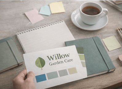
What Different Colours Tend to Communicate

While colour meaning isn’t an exact science, certain colours are widely associated with particular emotions:
- Blue – Trust, reliability, calm (often used by professional services)
- Green – Growth, health, nature (popular with wellbeing and eco-focused brands)
- Red – Energy, urgency, passion (use sparingly for calls to action)
- Yellow – Optimism, warmth, friendliness
- Black – Sophistication, authority, luxury
The key is using these colours in a way that aligns with your brand personality.
Your Brand Comes First
Colour psychology should support your brand – not override it. A playful children’s activity business will naturally use brighter colours than a financial consultant, and that’s exactly as it should be.
Consistency matters too. Using a clear colour palette across your website, logo, and marketing materials builds recognition and trust.
Colour and Accessibility
Good colour choices aren’t just about aesthetics – they’re about usability. Low contrast text, overly pale colours, or clashing tones can make your site hard to read.
Ensuring enough contrast between text and background helps everyone, including users with visual impairments or colour blindness.
Using Colour to Guide Action

Strategic use of colour can gently guide visitors towards taking action. Buttons, links, and calls to action should stand out clearly from the rest of the page without feeling aggressive.
Often, one strong accent colour used consistently for actions works far better than lots of competing colours.
Final Thoughts
Your website is speaking to visitors long before they read your content – and colour is a big part of that conversation.
When used thoughtfully, colour psychology helps your website feel more professional, more trustworthy, and more aligned with your business.